In industries like financial services, we have learned to expect that all communication will be formal, stern and, quite frankly, boring. It’s all insider jargon and confusing acronyms — any sort of personality is a rare sight. But it doesn’t have to be that way…
At Wise, we allow people to send, spend and receive money all over the world. Whether you’re sending money back to your family or buying your dream home abroad, we take moving your money around the world seriously. However, that doesn’t mean we can’t have fun whilst we do it.
We have recently launched instant transfers, allowing you to send money from Europe to the UK in seconds, not days. A big step towards our mission of getting money moving instantly all over the world. The way we see it, if you’re able to send your friend a cat video in seconds, you should be able to send them money just as quickly.
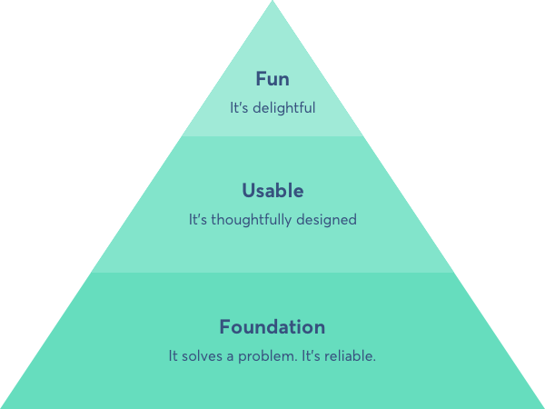
Foundations before fun
From the outset, we knew we wanted the instant transfer experience to delight users. But before the fun, we had to get the foundations right.
You can think of product design and development like Maslow’s hierarchy of needs. Users need the basics first. For Maslow, that was food, water and shelter. For us, it’s solving a real customer problem and building a reliable service.

In the case of instant transfers, the foundations we focussed on were:
- Solve a real customer problem: Users can’t always get their money to their recipient as and when it’s needed. Whether it’s a family emergency or a bill to pay, the flow of people’s money is set to the company’s timeline, not theirs.
- Make it reliable: We had to build the ‘pipes’ that allow users to send their money instantly. The reliability was measured by the number of transfers that get processed as ‘instant transfers’. This had to be a high percentage before we could launch a true ‘instant product’. It may be more ‘back-end’ focussed but it is key to building a great user experience.
- Design an end-to-end experience: We set out to design a clear and transparent end-to-end instant transfer experience. We wanted users to clearly understand when they will and will not get an instant transfer.
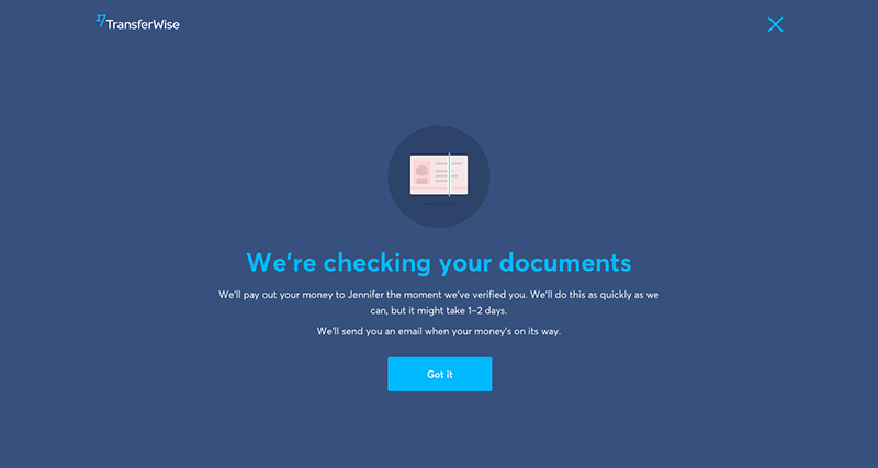
To design a foundational and usable experience, we had to gracefully handle any situation that could go wrong. When things do go wrong, and they occasionally will, it is the time to be more factual than fun. The focus should be to educate your users on what went wrong and what to do next.
For example, if a user’s account is being verified, their transfer can’t be processed instantly. In that case, we must communicate clearly what happens next.

Aim to delight your users when you exceed expectations. But provide humble transparency when you occasionally but inevitably fail.
However, if you fail on the foundations, your product will not be useful nor usable. Trying to design for fun at this point can have a negative effect. It may leave users with the perception that you’re focussing on the wrong things first.
Make room for delight
Through user research, we discovered that one of the biggest benefits of instant transfers is that it gives users peace of mind. They no longer have to come back and check if their transfer is complete. Or worry about when their money will get there. It helps to reduce their mental load.
In addition to this, people’s current expectations for international money transfer are sadly low. Banks and other providers often take several days to move their money internationally. That’s also on top of their high prices and hidden fees.
By surpassing user expectations and reducing their worry, we opened up an opportunity to delight. We wanted to step up to this opportunity. Using entertaining animation and clever copy, we aimed to deliver fun in an otherwise serious industry.
Motion design
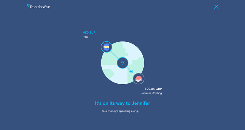
An animation was designed to guide the user through each step of their transfer completion. For example, when sending money from Europe to the UK, the user would see:
- Their money reaching Wise’s European account
- Wise checking the status of their transfer and for any issues e.g. fraud checks
- Their money being sent from Wise’s UK account to their recipient
All scenarios were designed into a single file to ensure smooth transitions, minimise development effort and reduce file size. This included all edge cases, e.g. verification. It was initially designed in After Effects and then exported as a .json using Bodymovin. This single file was then implemented across web, iOS and Android using Lottie. These amazing tools allow animations to be implemented exactly as the designer intended, with minimal development time. Then, to get the desired experience, your developers have full control to play, pause, loop, adjust speed, scale and much more.
Copy
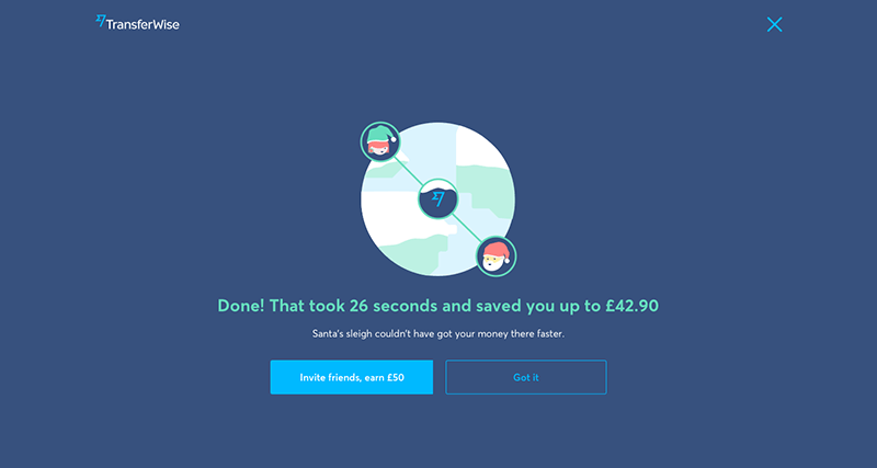
We also wanted to create a delightful experience through copy. Upon success, we present the user with a randomised ‘speed fact’. The speed of the transfer is calculated based on the rough sending and receiving locations. We then compare the speed of their transfer against anything from ‘cheetahs’ all the way to the ‘speed of sound’.
The instant experience was designed over many iterations and was thoroughly user tested. With user after user, we qualitatively witnessed the benefits of a fun experience. Whether it was through laughter or positive comments, the delight factor of this instant experience shone through with users.
Easter eggs at Christmas
We didn’t want to stop there. By adding a little UI easter egg to the flow, we wanted to spread some holiday cheer. Easter eggs are something within your product that surprise and delight your users. Something that is not required for the product to function. But, it can be that little cherry on top that takes your product from functional to fun.
Until December 25th, we are replacing our illustrations, animation and copy with something a little more festive. Our easter egg may not be as clever as typing ‘askew’ into Google, but we hope it will delight our users.

The product benefits of fun
Delivering a fun experience can have more benefits than it may seem. Animation and microcopy can be used to educate your users. Like at school, the most memorable classes were always the most fun.
In this product, we hoped to achieve the following:
- Build an awareness of what our product is good at. At Wise, the ‘speed’ of transfer completion is one of our key ‘product pillars’. It’s one of the reasons our customers choose us. Through the use of animation and copy, we bring a higher level of awareness to just how ‘speedy’ our product is.
- Build a consistent mental model of how Wise works. Sending money internationally through a 3rd party provider can be confusing. We often find users confused about why they need to send money to Wise, and not to their recipient directly. The animation was designed to reinforce the mental model of how their money flows. This is one of several places in our product we aim to educate on this. To help it stick — don’t build a mental model in a single place in your product, consistently reinforce it throughout.

Fun products are human products
Overall, the foundation of the new instant transfer experience was to solve a real customer problem. Allowing customers to move money around the world on their timeline, not ours. But we wanted to go beyond this and create an experience that would delight.
In industries like financial services, companies rarely design for fun. Getting their product foundations right should be their first priority. But very few companies are going beyond this and looking to delight their customers. Building the foundation gets you customers. Designing for delight gets you brand advocates.
With instant transfer, we wanted to bring a fun and more human experience to financial services. Reminding our customers that beyond the clever tech that moves their money around the world, there are real people that are solving problems for them.
*Please see terms of use and product availability for your region or visit Wise fees and pricing for the most up to date pricing and fee information.
This publication is provided for general information purposes and does not constitute legal, tax or other professional advice from Wise Payments Limited or its subsidiaries and its affiliates, and it is not intended as a substitute for obtaining advice from a financial advisor or any other professional.
We make no representations, warranties or guarantees, whether expressed or implied, that the content in the publication is accurate, complete or up to date.

